Q&A with Vice President Katharine Laidlaw: Rediscovering and redefining the Interlochen brand
Interlochen’s vice president of strategic communications and engagement discusses the process underway to reinvigorate the Interlochen brand.

Interlochen's vice president of strategic communications and engagement, Katharine Laidlaw.
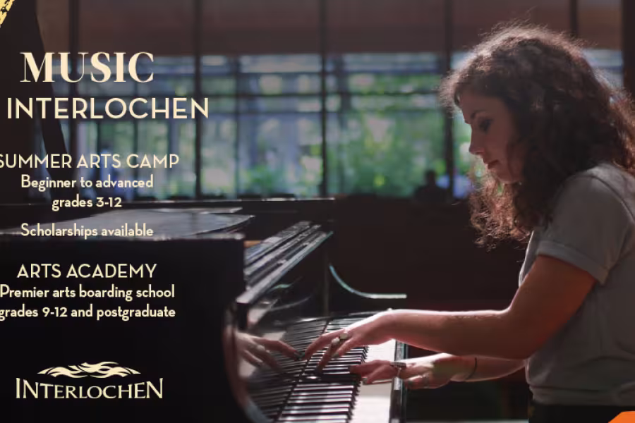
A recent music flyer exhibiting Interlochen's new visual identity. (This piece has been resized to fit this space.)
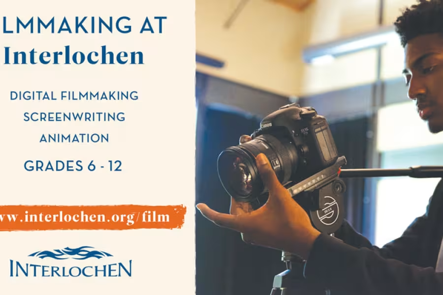
A filmmaking flyer designed using Interlochen's new visual identity. (This flyer has been resized to fit this space.)
Moments after she first stepped onto the Interlochen campus, Katharine Laidlaw marveled at the exuberance and joy of young artists at Interlochen Arts Camp. “I was struck by their profound connection to their art and to one another,” recalls Laidlaw. “They were truly in their element. You could see them becoming their best selves.”
Laidlaw was in her 20s then, attending a summertime concert on campus. The experience made a lasting impression, convincing her there was no place more inspiring for a young creative person to grow in the arts than Interlochen. In 2018, Laidlaw accepted the offer to serve as the institution’s vice president for strategic communications and engagement, overseeing branding, marketing and content, public relations, and stakeholder engagement.
The role was a natural next step for Laidlaw, whose passion for the arts propelled her career, first as a producer and marketing director of commercial theatre, and most recently, as the chief marketing officer at the University of North Carolina School of the Arts (UNCSA), where she led numerous strategic initiatives, including a successful rebranding.
Laidlaw is drawing on that professional experience and others in her approach to reinvigorating Interlochen’s communications and marketing. Galvanized by insights from Interlochen alumni, current and prospective students, parents, donors, faculty, and staff, Laidlaw charted a course for a new brand strategy and visual identity—the language, colors, imagery, and other elements that convey Interlochen’s world-class educational, artistic, and cultural programs.
Here, Laidlaw chats with Crescendo about her passion for the arts, the rigorous research behind Interlochen’s emerging new brand, and some of the changes to look out for in the coming months.
How did you first get involved in the arts?
I’ve been passionate about the arts my entire life, and at varying points, I studied music, theatre, and ballet. While I loved acting, I was really drawn to behind-the-scenes work, specifically producing. I began my career in commercial theatre, first interning for the largest commercial producing company in Australia. Later, I worked as a producer and marketing director for a major commercial theatrical company in Chicago, and then another in New York, producing shows on Broadway, off Broadway, in the West End, and regionally.
After getting my MBA at UNC-Chapel Hill and several stints in corporate marketing (Coca-Cola, Hanesbrands), I became the first executive producer at the University of North Carolina School of the Arts, and later, its first chief marketing officer. I spent 10 years at UNCSA before coming to Interlochen.
What was your first impression of Interlochen?
Generations of my family have summered in the area, and when I was in my 20s, I began attending concerts and events at Interlochen. There’s nothing like strolling from your car to campus and hearing a measure of a Rachmaninoff symphony in one ear and a recitation of Shakespeare in the other, along with the low, soft strumming of a guitar with a refrain from a Broadway tune floating above, all interspersed with the laughter and chirping of young people. You really feel the arts merge and collide at Interlochen.
I was amazed by the youthful creative energy of this place. It literally buzzes with excitement and possibility. And this kind of environment stimulates such positive growth and self-discovery. Interlochen instills creative confidence, and there’s no limit to what one can achieve with that mindset. I wish my parents had sent me to Camp!
How did you determine that the Interlochen brand needed to be refined?
One of my first steps in the job was to assess all our marketing and communication materials. What I found was a real lack of cohesion in the verbal and visual expression of the brand. Branding is an art, but it’s also a science, where rules and discipline are essential. Our team evaluated the strength of our brand guidelines and the adherence to those guidelines throughout the institution, and found real gaps. Over time, I believe our organization had become accustomed to describing and depicting Interlochen in a very personal, individual way, depending on who was developing the piece. It’s not that any of it was inaccurate, it just didn't reinforce a clear, compelling, and unified expression of our brand.
We needed a North Star to guide us, and a visual identity that would give our brand a more contemporary feel. Interlochen has always been a leader in the arts, so our branding should be more forward-leaning.
How did you approach the design process?
This was an intensive process that began with research. Over the course of more than a year, we interviewed hundreds of stakeholders representing every Interlochen constituency. We wanted to understand their most powerful associations with Interlochen and what they took away from their experience. We synthesized their feedback into a messaging map to reflect Interlochen’s unique value proposition. From there, we further refined the brand identity through a positioning statement and personality traits.
Only then were we able to start work on the creative platform and an update to the visual language. Through the new identity, we sought to express the brand in a way that would appeal to prospective students and families of today, while feeling authentic to current students and alumni. We then tested these elements through focus groups with Camp and Academy students, and through quantitative surveys with prospective students and parents.
How do the new visual brand assets reflect the character of Interlochen?
Our research confirmed that the physical environment is central to the Interlochen experience. With that in mind, we expanded the palette to include colors that would evoke the indigenous colors of northern Michigan, and more specifically, our campus. There’s an energy and vibrancy to our new palette, which is intended to reflect the curiosity, wonder, and joy of this institution. We even gave our colors branded names like “Duck Lake,” “Green Lake,” “Summer Sun,” and “Sand Dune.”
The textural elements, such as the brush stroke and the organic shapes, are a nod both to the interdisciplinary nature of Interlochen, and also to our mission. We seek to inspire a lifelong love of the arts. Every child is an artist, beginning with simple finger paints and molding clay. Through these universal symbols of artistic expression, we’re invoking how creativity begins, and how it inherently lives within us all.
Are there any elements of the new visual identity that were carried over from Interlochen’s previous look and feel?
Nostalgia at Interlochen runs deep. Students attend Camp or Academy during some of the most impressionable years of their life. For parents, watching your child develop at Interlochen is nearly as transformative. I know—my daughter attended Camp for the first time as a junior camper in 2019!
To honor the past while still looking towards the future, we incorporated colors from previous iterations of the brand into our palette, like the hallmark red and blues, and updated them with modern hues for a more contemporary feel.
Has the pandemic affected the rollout of the brand?
This process began long before the pandemic, with the new visual identity approved by our board in July of 2018, and additional elements approved last March.
In a way, the pandemic validates the urgency of this work to articulate who we are and why we matter. Around the world, arts organizations are stepping forward in new ways to offer inspiration and some sense of reprieve, as we did this summer with Interlochen Online. This is a time when organizations must innovate to stay relevant and connected to their audiences. In that sense, it’s a perfect time to roll out a new brand.
What sorts of changes can we expect to see on campus and online?
Last fall we started to incorporate the new look and feel into many of our marketing materials. Currently, we are waist-deep in developing a new website, set to launch in a few months, which will be the most robust expression of our brand. Finally, as I’ve previewed to our students and staff, there’s one final piece of the visual identity that we’ll reveal soon.
What have you heard so far from the Interlochen community about the updated brand?
It’s been amazing. Change can be hard at established and revered institutions like Interlochen, but the campus community and our board enthusiastically embraced the new brand strategy and visual identity. The messaging resonated with them and everyone is eager to see the brand energize and elevate Interlochen in new and exciting ways.
(This interview has been condensed and edited for clarity.)